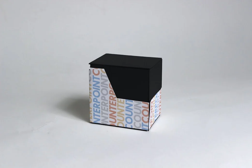
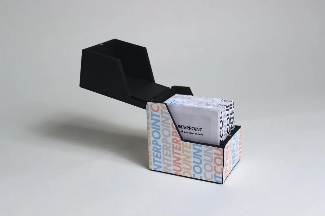
Counterpoint is a card-based party game based on logic, creativity, and randomly generated funny situations that I created with a friend for a studio class. It plays like a combination of Apples To Apples, Cards Against Humanity, and Mad Libs, where players must explain the best uses of people, places, and objects in various fill-in-the-blank scenarios. The focus on communication skills and strange logic gives Counterpoint its subtitle, “the game of creative debate." (For a full explanation of the gameplay, the rules can be read below.)
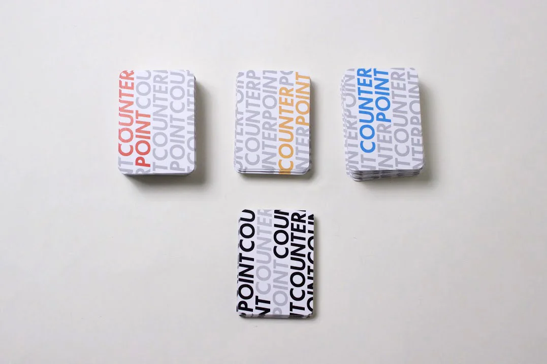
Counterpoint's gameplay was developed through a rigorous cycle of play-testing, refining, and replaying, and its visual design went through just as many changes. We needed a color-based system to differentiate between object, person, place, and scenario cards, but we did not want them to become visually distracting. Our early experiments with different colors, icons, striped patterns, and black backgrounds produced results that, while interesting, did not capture the idea of our product both as a game and a piece of design.
We finally landed on a design that combined branding, pattern, and pleasant primary colors into a subtle, minimalist appearance. Applied to both the backs of the cards and the foamcore box, this repeated pattern of name and color gave the whole Counterpoint set a cohesive graphic element, making it as fun to look at as it was to play.


